# 5、绘制个人签名页
接下来,我们要在小程序加载的首个页面index中 绘制个人签名的页面样式。
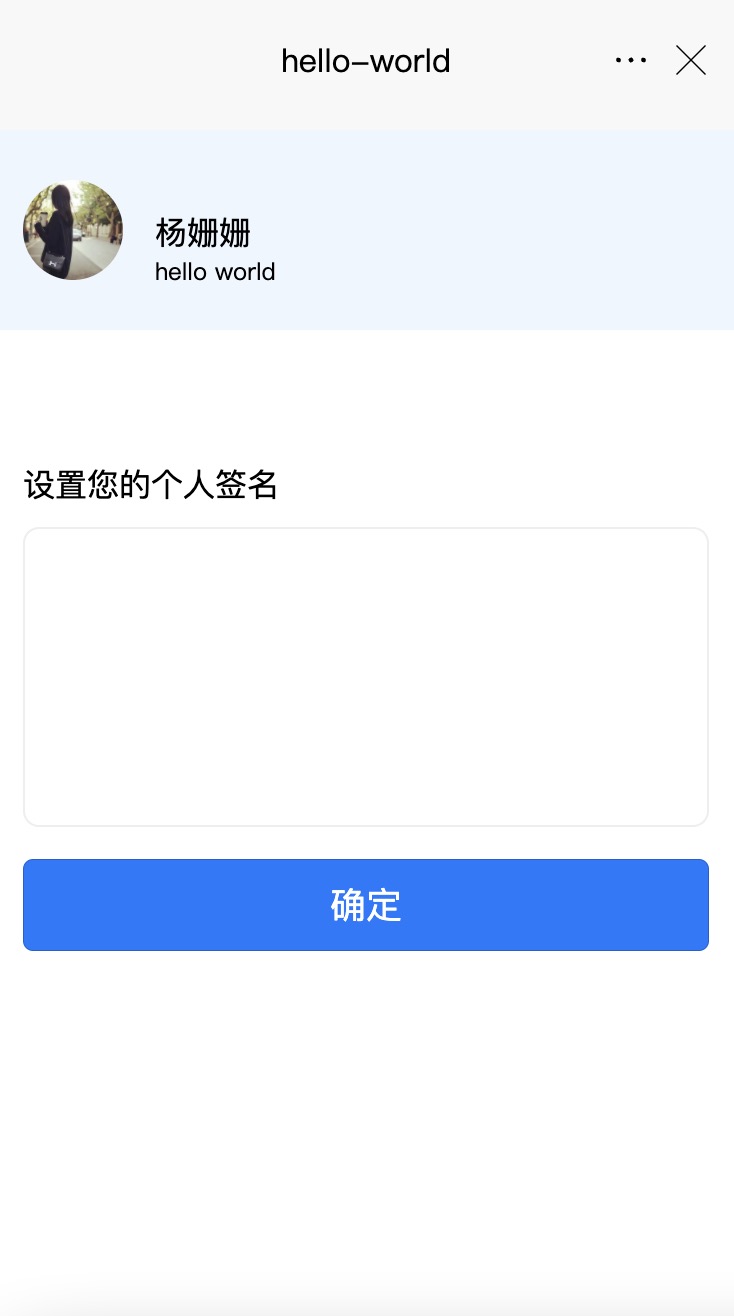
目标效果:
# 了解一个页面的不同描述文件
index文件夹包含2个描述该页面的文件,注意:页面路径跟page.json中的路径需要一一对应即可。
- index.vue 结合vue的单文件,参考vue的写法,同时支持wx的dsl。
- index.scss 如果样式需要抽离,可以抽离单独的样式文件,在.vue中引入。
# 绘制页面结构
请将以下代码 拷贝到 .vue 文件的template模块中:
<template>
	<view class="content">
		<view class="user-box">
			<image :src="avatarUrl" />
			<view class="user-info">
				<view>杨姗姗</view>
				<view class="user-sign">{{sign}}</view>
			</view>
		</view>
		<view class="input-box">
			<view>设置您的个人签名</view>
			<textarea class="input-area" v-model="inputSign" name="" id="" cols="30" rows="10"></textarea>
		</view>
		<button class="confirm-btn" @click="confirm" type="primary">确定</button>
	</view>
</template>
1
2
3
4
5
6
7
8
9
10
11
12
13
14
15
16
2
3
4
5
6
7
8
9
10
11
12
13
14
15
16
请将以下代码 拷贝到.vue中的style模块中。
.user-box {
		height: 200rpx;
		display: flex;
		align-items: center;
		box-sizing: border-box;
		padding-left: 32rpx;
		background: #eef6ff;
		image {
			width: 100rpx;
			height: 100rpx;
			border-radius: 50%;
		}
		.user-info {
			flex: 1;
			margin-left: 32rpx;
			height: 100%;
			margin-top: 50%;
			transform: translateY(-50%);
		}
		.user-sign {
			font-size: 12px;
		}
	}
	.input-box {
		padding: 32rpx;
		margin-top: 100rpx;
		.input-area {
			width: 100%;
			border: 1px solid #eee;
			margin-top: 20rpx;
			border-radius: 8px;
			box-sizing: border-box;
			padding: 20rpx;
		}
	}
	.confirm-btn {
		margin: 0 32rpx;
	}
1
2
3
4
5
6
7
8
9
10
11
12
13
14
15
16
17
18
19
20
21
22
23
24
25
26
27
28
29
30
31
32
33
34
35
36
37
38
39
40
2
3
4
5
6
7
8
9
10
11
12
13
14
15
16
17
18
19
20
21
22
23
24
25
26
27
28
29
30
31
32
33
34
35
36
37
38
39
40
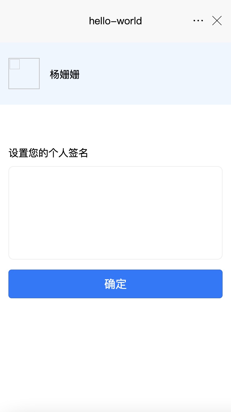
保存后 在IDE模拟器中可看到运行效果如下:
# 代码解析
在template模块中,定义所有的页面组件。组件被包裹在一个最大的
- user-box 代表个人信息,包括左侧的头像图片(image组件) 和 右侧的个人姓名、个人签名展示(text组件)
- input-box 代表 设置签名功能,包括 录入个人签名的多行文本框(textarea组件) 和 确定按钮(button组件)
这里我们以 头像图片组件 以及 确定按钮组件为例 来分析一下代码。
# 头像图片组件
template模块中的以下代码,实现了头像图片组件的效果:
    <view class="user-box">
        <image :src="avatarUrl" />
        <view class="user-info">
            <view>杨姗姗</view>
            <view class="user-sign">{{sign}}</view>
        </view>
	</view>
1
2
3
4
5
6
7
2
3
4
5
6
7
class=“user-box” 代表在 style 模块中查找定义为 user-box 的样式描述,即:
    .user-box {
		height: 200rpx;
		display: flex;
		align-items: center;
		box-sizing: border-box;
		padding-left: 32rpx;
		background: #eef6ff;
		image {
			width: 100rpx;
			height: 100rpx;
			border-radius: 50%;
		}
		.user-info {
			flex: 1;
			margin-left: 32rpx;
			height: 100%;
			margin-top: 50%;
			transform: translateY(-50%);
		}
		.user-sign {
			font-size: 12px;
		}
	}
1
2
3
4
5
6
7
8
9
10
11
12
13
14
15
16
17
18
19
20
21
22
23
2
3
4
5
6
7
8
9
10
11
12
13
14
15
16
17
18
19
20
21
22
23
image组件的具体用法可参考文档image组件。其中我们要用到src属性,代表图片资源地址。
# 确定按钮组件
template模块中的以下代码,实现了确定按钮组件的效果:
<button class="confirm-btn" @click="confirm" type="primary">确定</button>
1
button组件的具体用法可参考文档button组件